Housing for Health NYC
Housing for Health is an initiative focused on high-acuity homelessness at the intersection of healthcare and housing.
Role: Design direction, illustrations
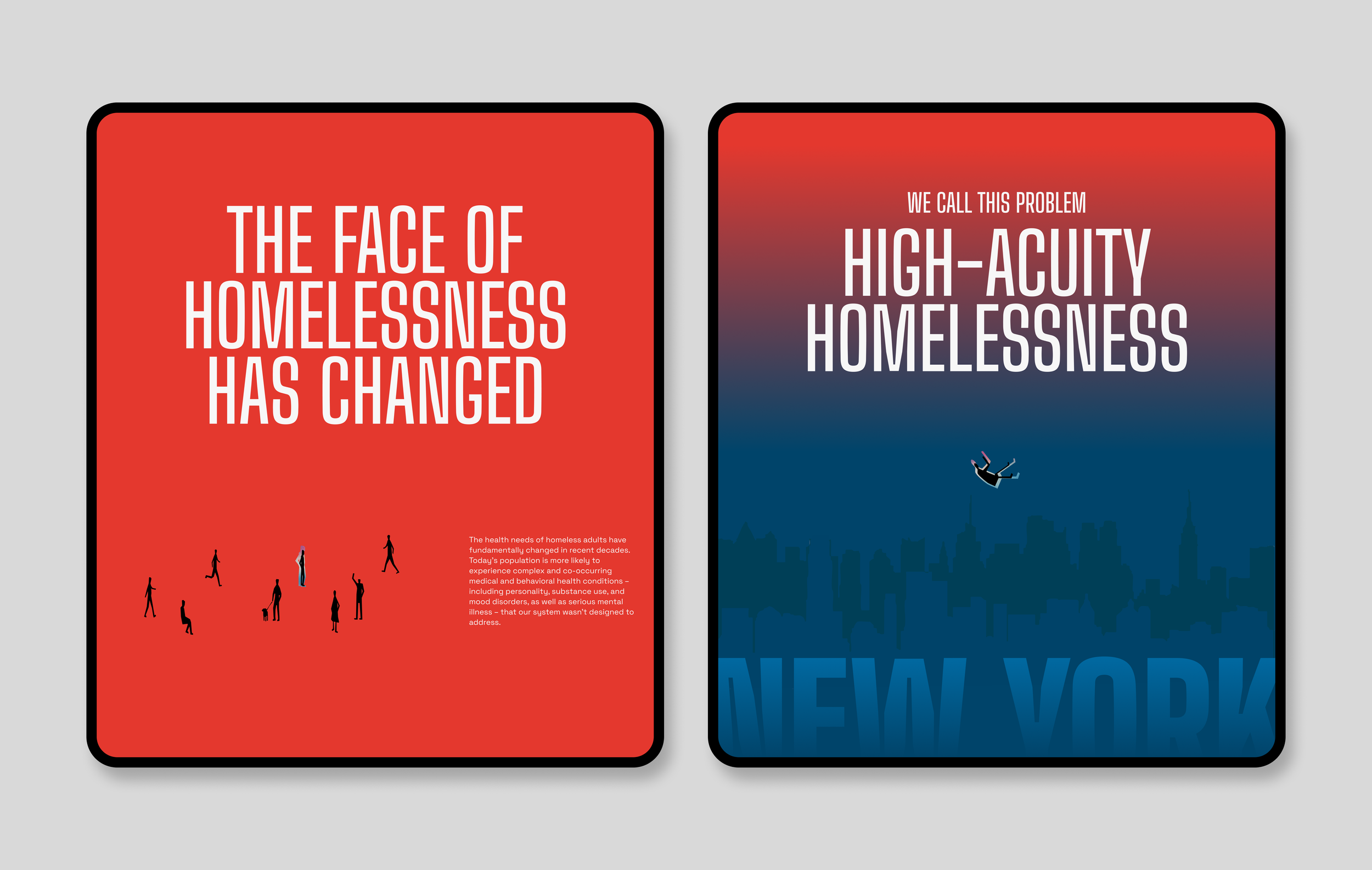
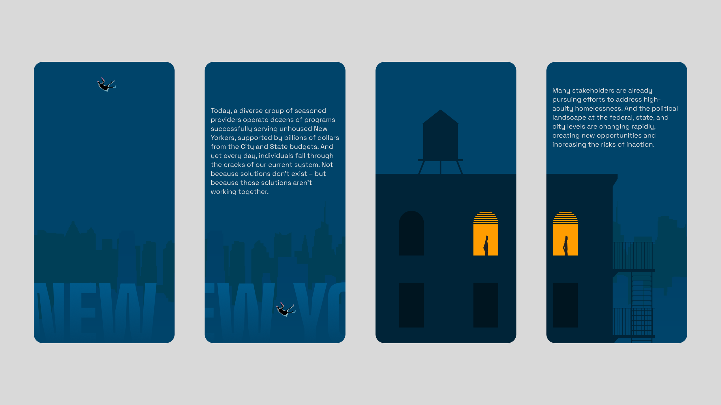
The ProblemThe original ask was to design a PDF explaining the problem and proposing a solution.
Very quickly, it became clear that a static document wouldn’t be enough. The system is complex, fragmented, and difficult to understand. The material needed to do more than inform.
It needed to engage and guide people through what exists today and what could change.
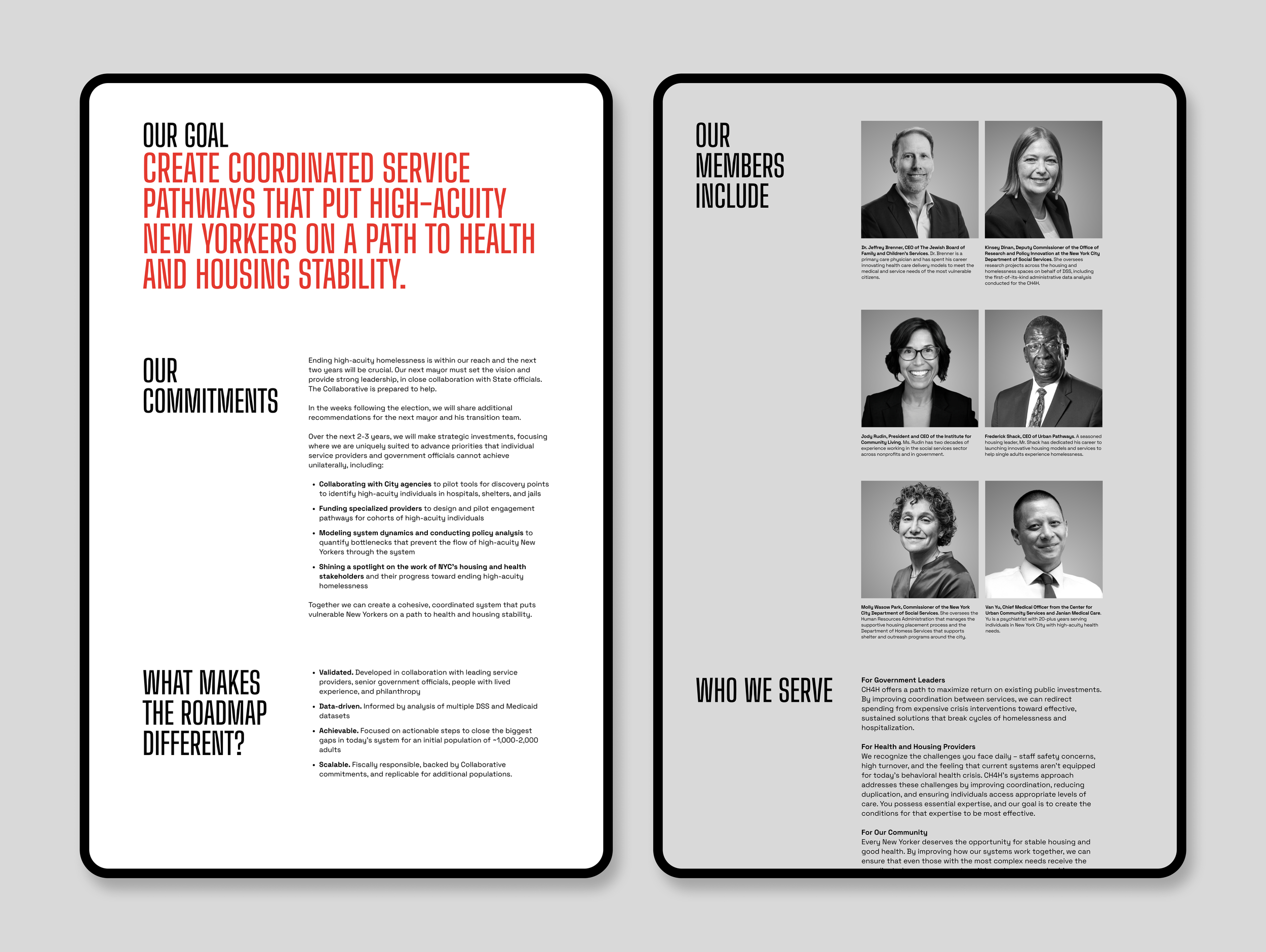
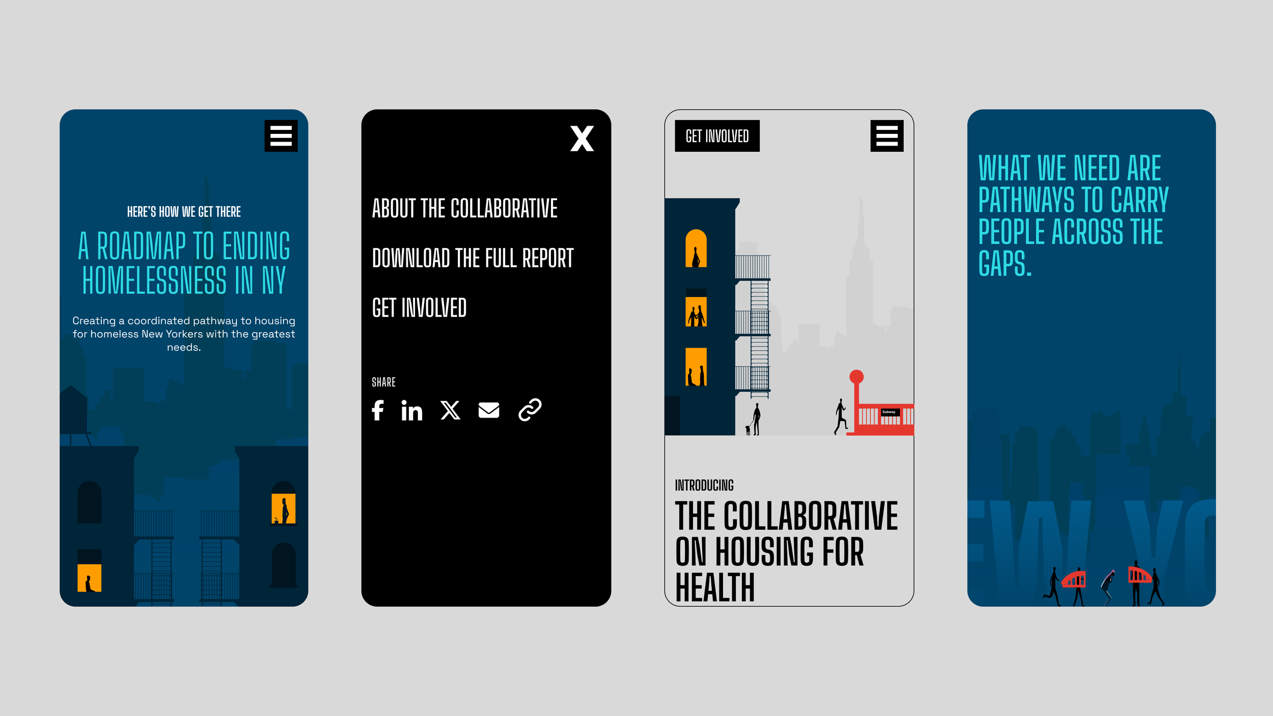
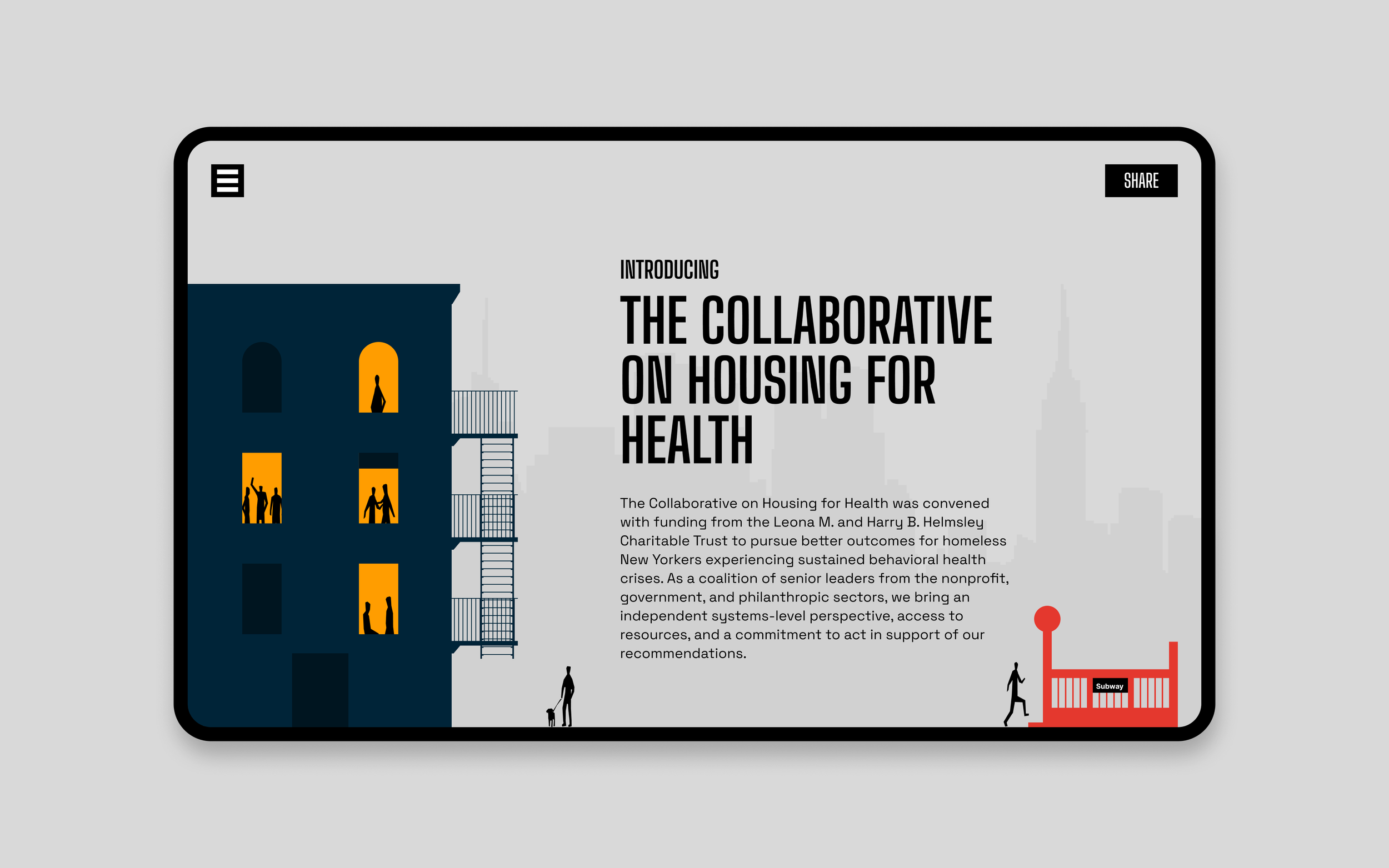
The ApproachThe direction shifted to a storytelling website that walks people through:
The problem
The current state
The proposed solution
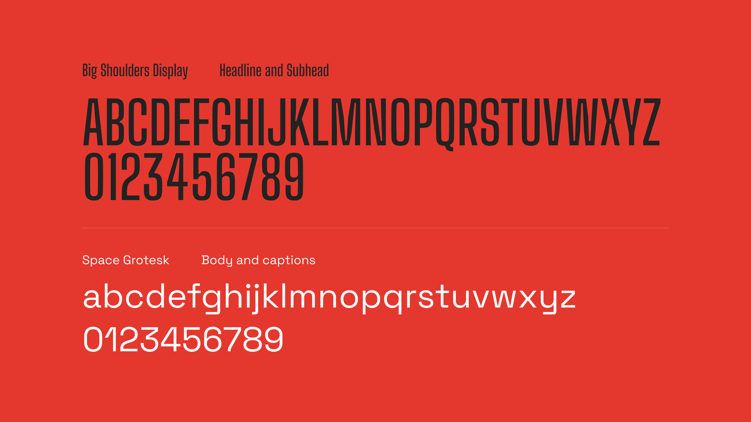
There was no existing visual identity. No color palette. No typography. No system. The project started from a blank slate.


The workDesign decisions were made in service of clarity and engagement.
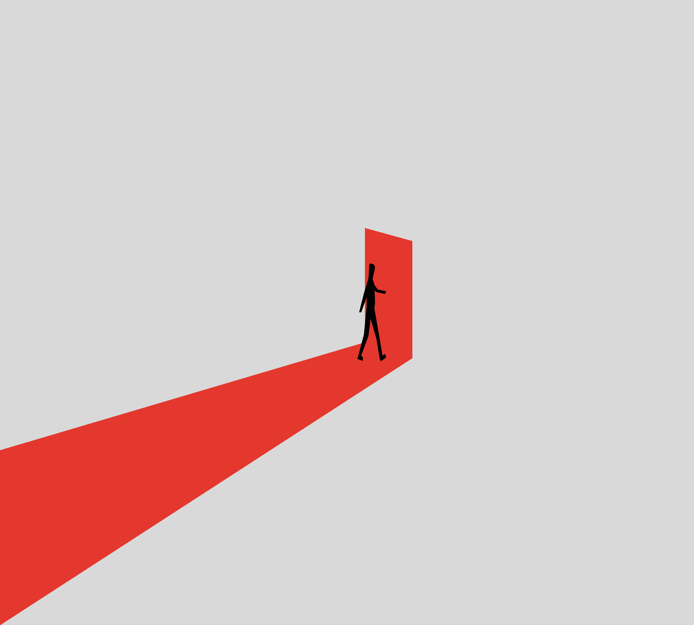
Motion is used to control pacing and flow
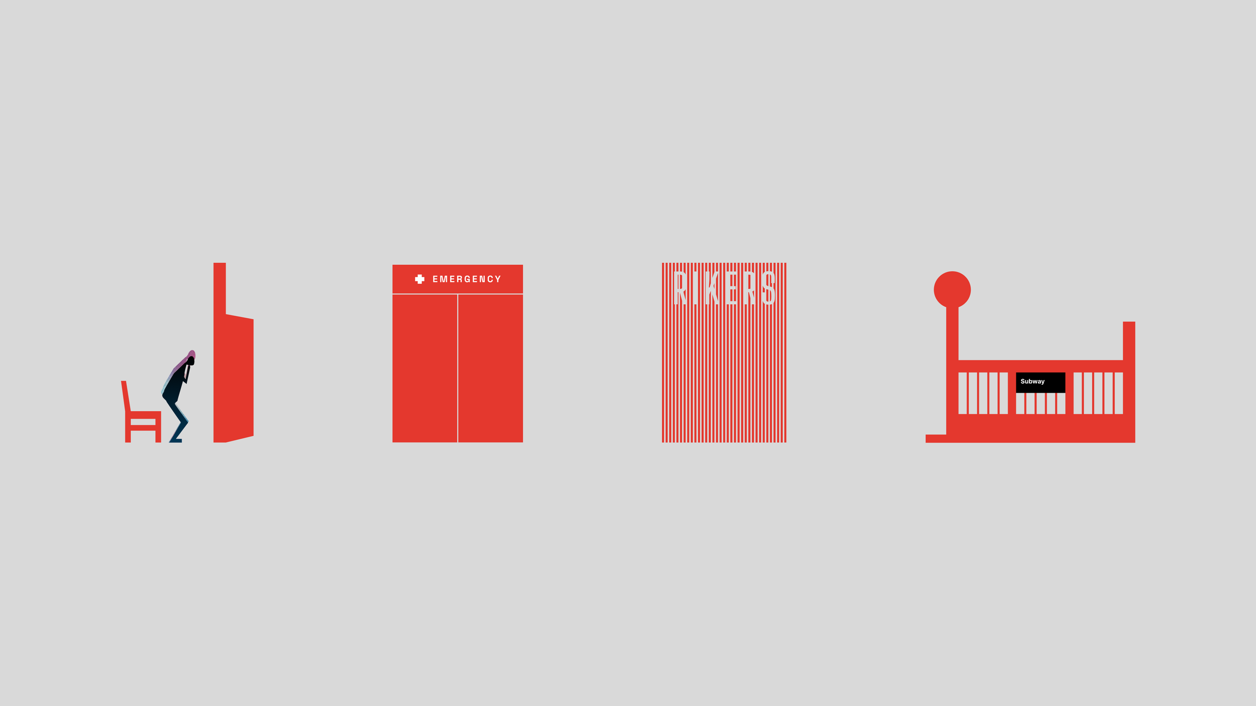
Large visuals help slow the experience and hold attention
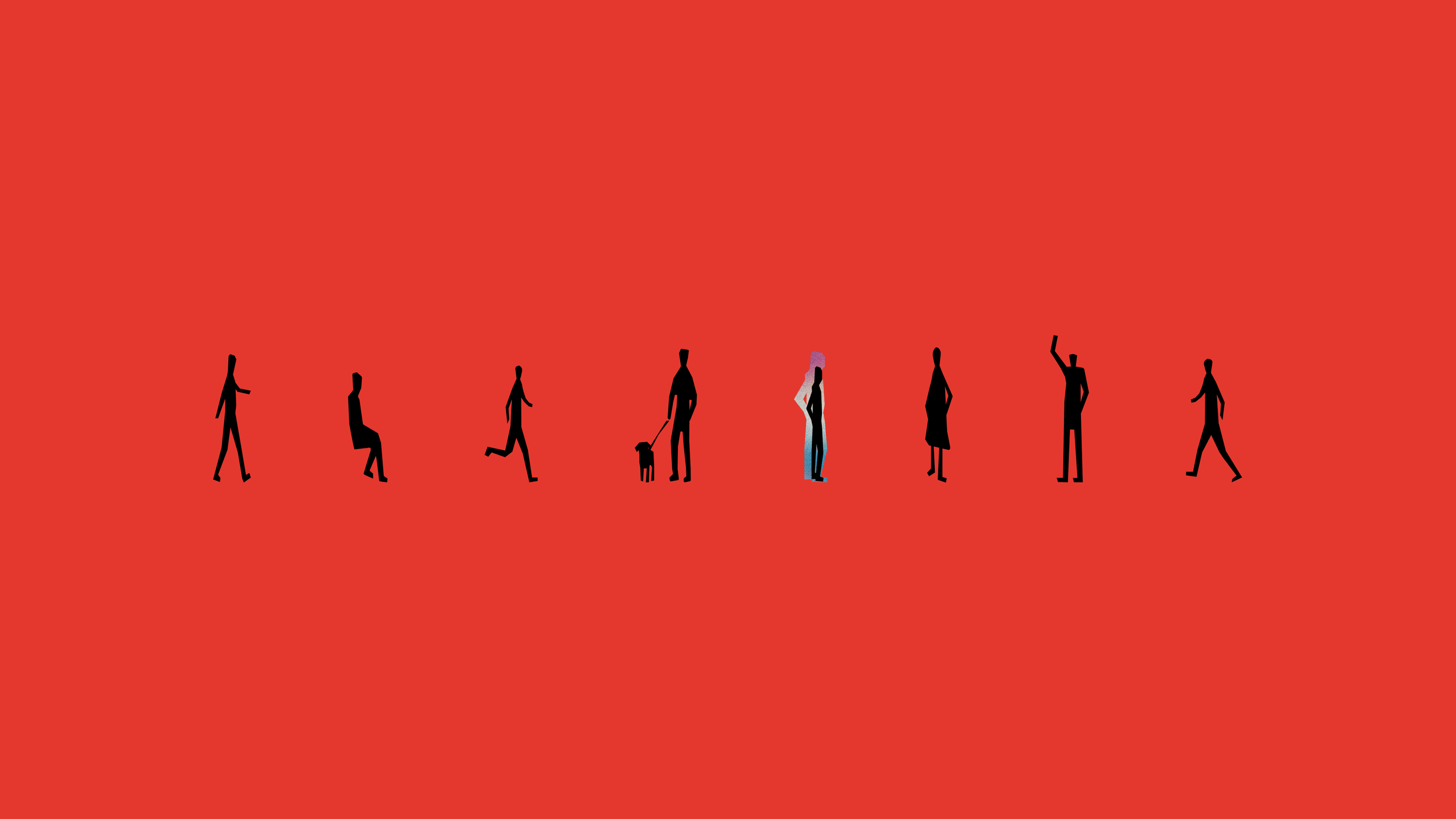
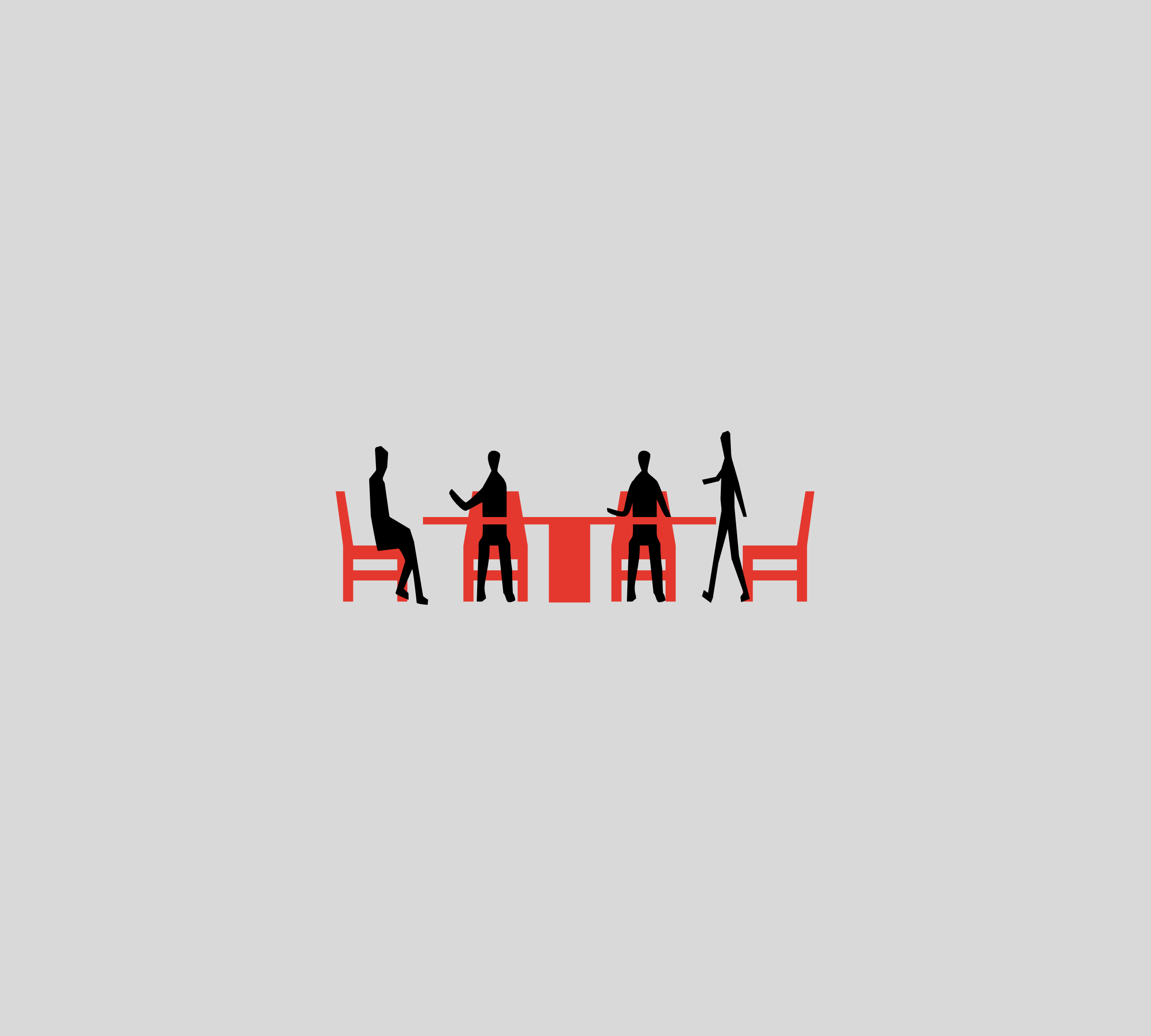
Characters are abstract by design, avoiding age, gender, or racial specificity
The system was built to support a narrative, not just a layout. Each section leads into the next, helping people understand how a fragmented set of services fits together.


My roleI led the design direction for the project.
Defined the concept and overall tone
Set color and typography
Created the illustration system
Designed the key art and experience
I worked with another designer on execution. I set the vision and visual system, and we developed the experience together.
Visit HousingForHealthNYC.org