Newsela Visual Redesign
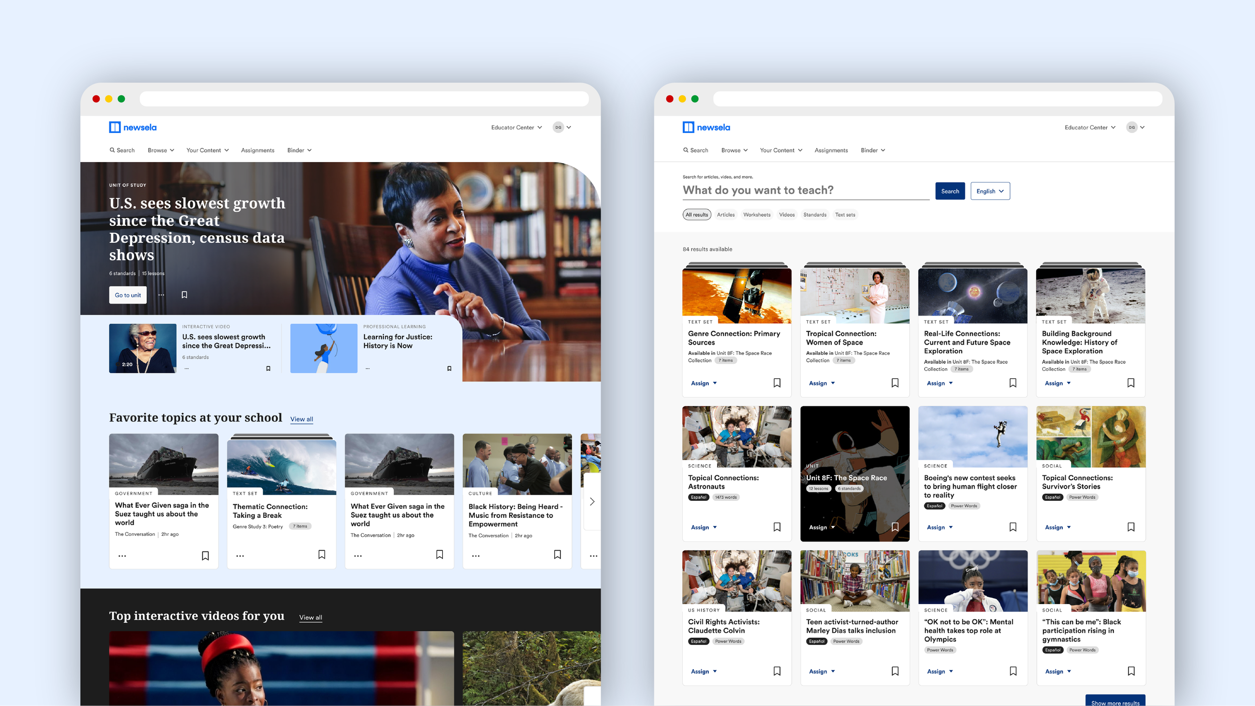
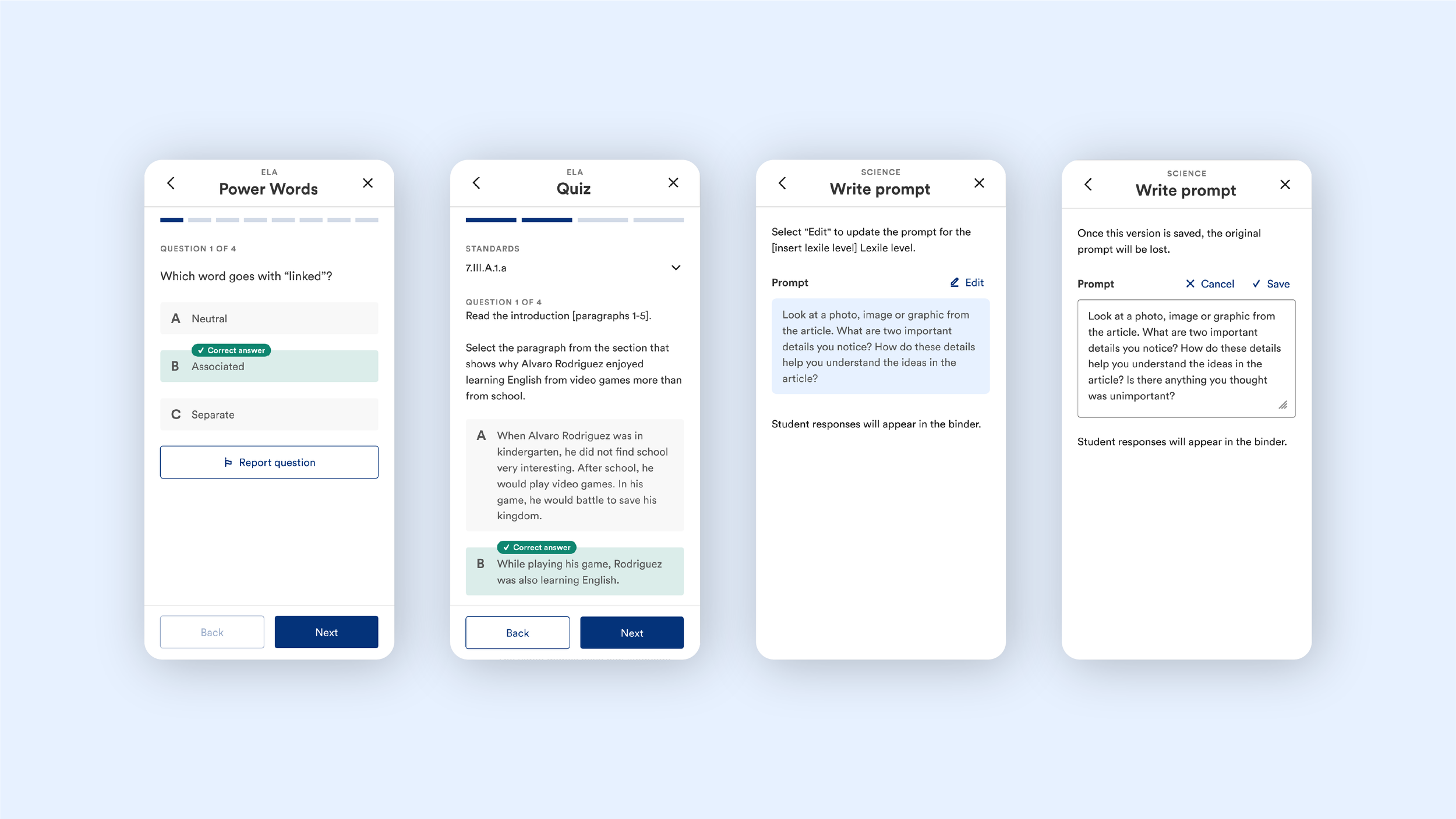
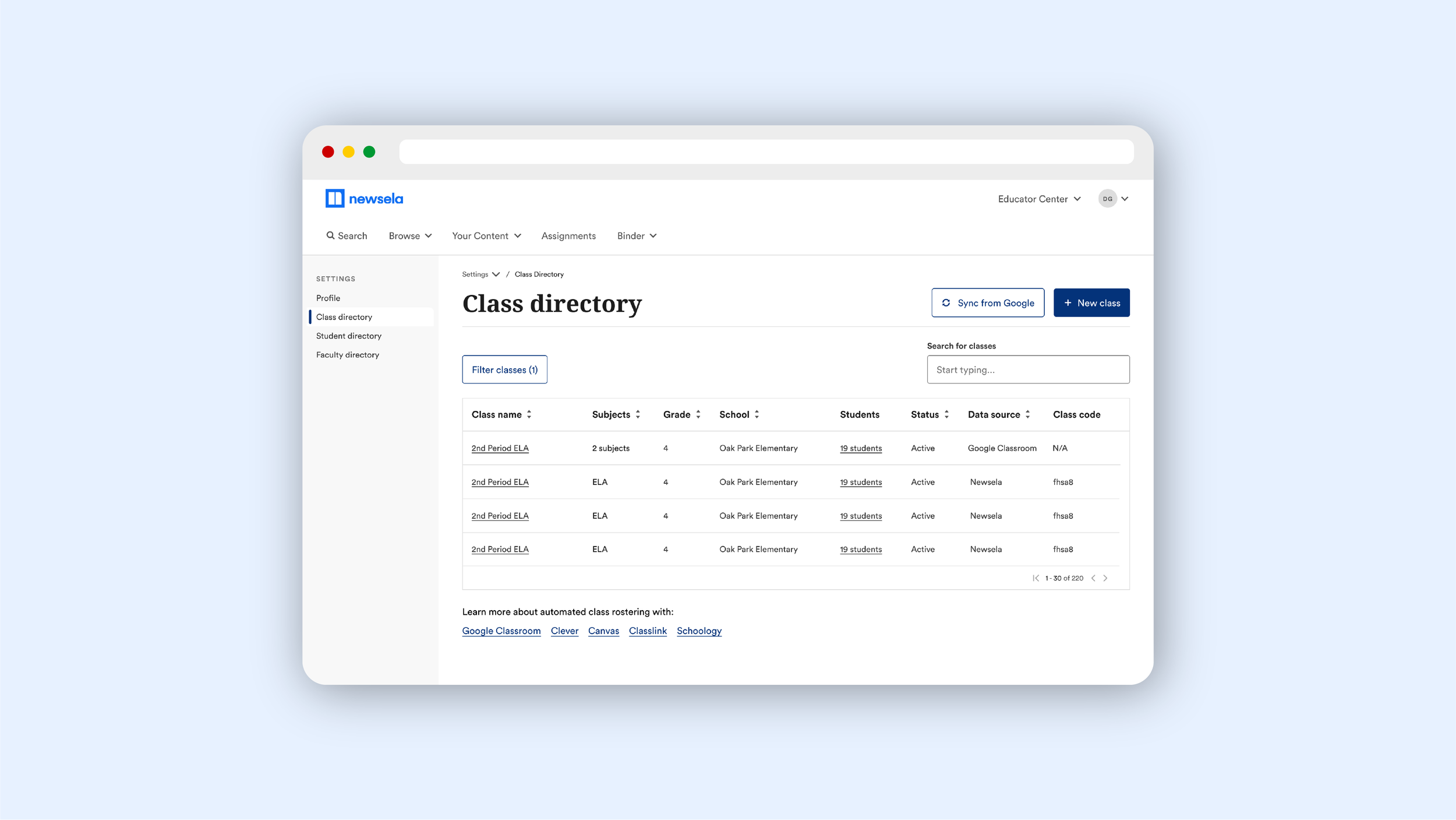
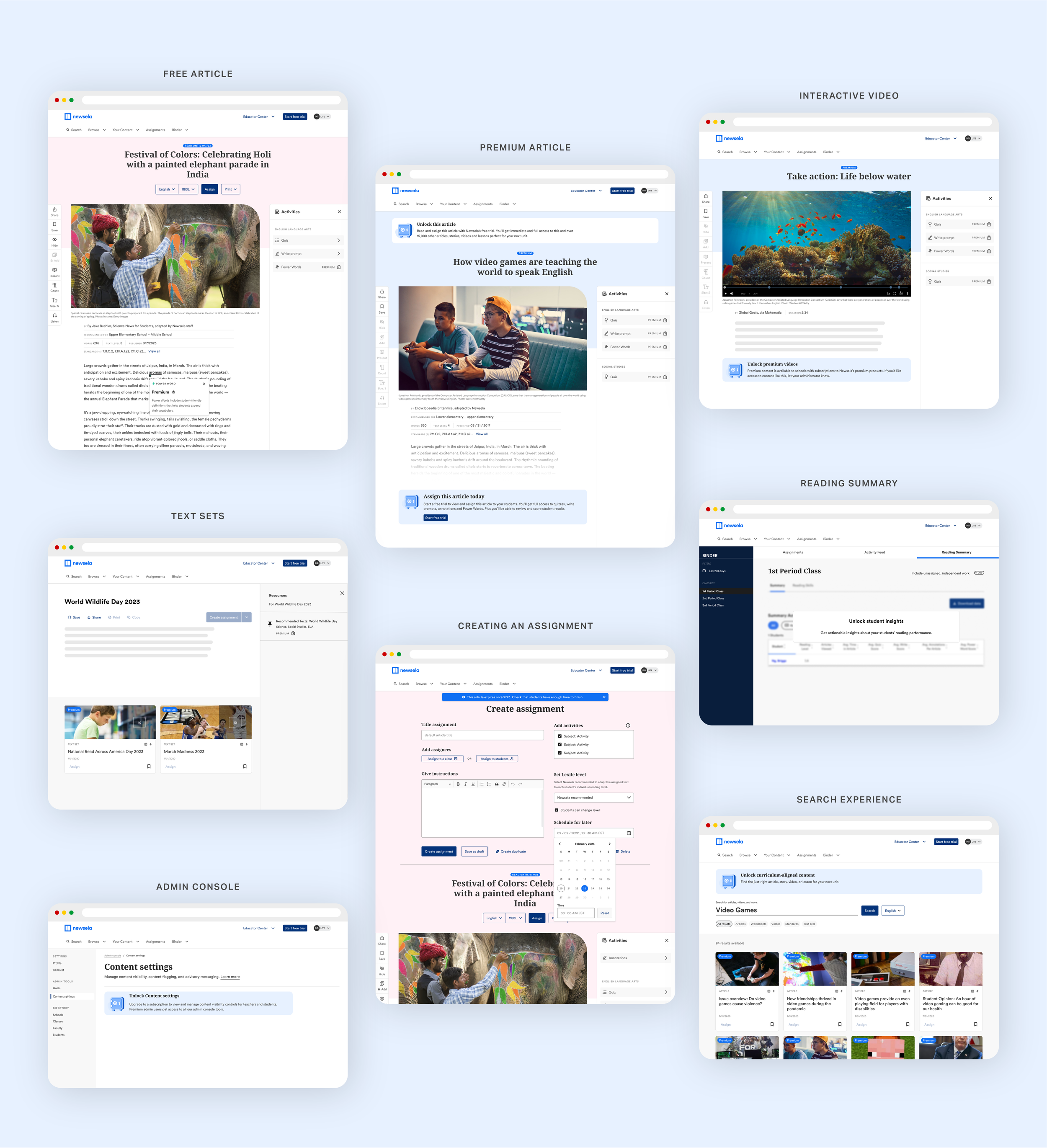
Newsela is an education platform used by teachers, students, and administrators across millions of classrooms. This project focused on redefining the product’s visual language so it could scale across teams, audiences, and experiences.
A cohesive visual system
As the product suite expanded, visual inconsistency began to create friction across experiences. The redesign focused on defining a clear system for typography, color, layout, and component usage that could scale with the organization.


Designing for multiple audiences
Newsela serves educators, students, and administrators, each with distinct needs and contexts. The visual system was designed to remain flexible across these audiences while maintaining a unified look and feel.
Supporting alignment across teams
Beyond individual screens, the work helped align design decisions across teams, creating a shared visual foundation that improved collaboration, efficiency, and overall product quality.
The result was a more coherent and scalable visual language, supporting Newsela’s mission while allowing the product to continue evolving with confidence.